The art direction of Clair Obscur: Expedition 33 is not merely one of the game's defining features; it is the foundational creative decision from which virtually every other aspect of the experience flows. The game won Best Art Direction at The Game Awards 2025, and the award was widely considered not just deserved but overdue -- a recognition that the team at Sandfall Interactive had achieved something genuinely unprecedented in the field of video game visual design. Drawing from Belle Epoque France, Post-Impressionist painting techniques, Art Deco architecture, Surrealist dream imagery, and theatrical composition principles, the game's visual identity is a rich blend of artistic influences that fuse into something unmistakably its own. What makes this achievement all the more remarkable is that it was accomplished by a team of approximately thirty people, a fraction of the size of the art departments at most studios producing visually ambitious AAA games. This guide explores the artistic influences, technical foundations, creative philosophies, and practical achievements that make Expedition 33 one of the most visually stunning games ever created.
Belle Epoque France: The Cultural and Historical Foundation
The Belle Epoque -- meaning 'Beautiful Era' in French -- is the period spanning roughly from 1871 to 1914, a time of extraordinary cultural flowering in France that saw the construction of the Eiffel Tower, the rise of Art Nouveau design, the flourishing of Impressionist and Post-Impressionist painting, and the development of Paris into the world capital of art, fashion, and intellectual discourse. This period serves as the primary cultural foundation for Expedition 33's visual design, and the influence is apparent in every environment, character design, and interface element in the game. The city of Lumiere, which functions as the game's central hub, is a lovingly detailed recreation of Belle Epoque Paris, complete with cobblestone boulevards lined with ornate lampposts, grand public buildings with elaborate facades, intimate cafes with wrought-iron furniture, and elegant residential quarters with flower-draped balconies. The fashion of the game's characters draws from the same period, featuring the tailored suits, flowing dresses, and distinctive accessories that defined Parisian style during the height of the Belle Epoque. But the influence goes deeper than surface-level aesthetics: the game captures the intellectual and cultural energy of the period, a time when artists, writers, and thinkers were engaged in passionate debates about the nature of reality, the purpose of art, and the relationship between the individual and society. These themes are not just backdrop for Expedition 33; they are woven into the game's narrative DNA, making the Belle Epoque influence felt at every level of the experience.
The commitment to Belle Epoque authenticity extends to the game's architectural detail, where every building, street, and public space reflects the specific design sensibilities of the period. Haussmann-style apartment buildings with their distinctive mansard roofs and elaborate window frames line the main boulevards, while smaller side streets reveal the more intimate and eclectic architectural styles that characterized Paris's less grand but no less beautiful neighborhoods. The Art Deco influence, which emerged from the later years of the Belle Epoque and into the 1920s, is visible in the geometric patterns, metallic accents, and streamlined forms that adorn many of the game's public buildings and significant structures. The Monolith itself incorporates Art Deco elements in its design, creating a visual connection between the curse's mechanism and the aesthetic language of the world's civilization. This architectural detail is not merely decorative; it tells the story of a society that values beauty, craftsmanship, and artistic expression, making the threat of the Gommage feel even more tragic as it threatens to erase a world of such extraordinary cultural richness.
The Painterly Aesthetic: A World That Looks Like a Living Canvas
The most distinctive and immediately recognizable element of Expedition 33's art direction is its painterly visual style, a design choice that makes the entire game world look as though it exists within a living, breathing painting. This is not simply a filter applied over realistic graphics; it is a fundamental artistic approach that affects every texture, every lighting setup, every environmental detail, and every character model in the game. Surfaces feature visible brush-stroke textures that suggest the physical application of paint, color palettes favor the rich, slightly muted tones of oil paintings rather than the photorealistic colors of conventional game graphics, and the overall composition of each scene reflects the principles of pictorial composition that painters have used for centuries. The effect is simultaneously immersive and aesthetically striking, creating a world that feels tangible and real while also feeling like a deliberate work of art. The painterly style serves the game's narrative as well as its visual design, since the world literally is a painting -- the visual approach reinforces the player's awareness that they are exploring a created reality, making the themes of art, creation, and the relationship between the creator and the created feel constantly present. This is environmental storytelling at its most sophisticated, where the visual style itself communicates information about the nature of the world and the philosophical questions that the narrative explores.
A world that looks like a living canvas is a good reminder that game art doesn't have to stay on screen. Our Ghost of Yotei White Hoodie keeps things minimal: clean white cotton blend, Atsu & Mount Yotei artwork, $44 USD with flat $10 worldwide shipping. It's the closest thing in our shop to a blank canvas.
Post-Impressionism, Surrealism, and Theatrical Influences
Beyond the Belle Epoque foundation and the painterly surface treatment, Expedition 33's art direction draws from several specific art movements and traditions that add layers of visual complexity and thematic resonance. Post-Impressionist painting techniques -- particularly those associated with artists like Cezanne, Van Gogh, and Seurat -- are visible in the game's approach to color, light, and texture. The way light interacts with surfaces in the game often mimics the broken brushwork and optical color mixing of Pointillism, while the emotional intensity of certain environments evokes the expressive color palettes of Van Gogh's most powerful works. Surrealist influences emerge most strongly in the game's more fantastical environments, where impossible geometries, dreamlike juxtapositions, and reality-warping visual effects create spaces that feel like they were pulled directly from the canvases of Dali, Magritte, or de Chirico. The Fracture zones -- areas where the fabric of the painted world is breaking down -- are particularly Surrealist in their visual design, featuring melting landscapes, floating architectural fragments, and perspective distortions that challenge the player's spatial perception. Theatrical influence is also evident in the game's dramatic compositions, which often frame scenes as though they were staged for a proscenium arch, with carefully positioned lighting, dynamic camera angles, and lens effects that create a cinematic quality without sacrificing the painterly aesthetic.
Unreal Engine 5: Technical Excellence Within an Artistic Framework
The technical foundation of Expedition 33's visual achievement is Epic Games' Unreal Engine 5, and the Sandfall Interactive team has leveraged the engine's most advanced features to realize their artistic vision with remarkable fidelity. Nanite, Unreal Engine 5's virtualized geometry system, allows the game to render extraordinarily detailed environments with billions of polygons without the performance penalties that would typically accompany such complexity. This means that the ornate architectural details of Lumiere, the organic textures of the Continent's wilderness, and the surreal geometries of the Fracture zones are all rendered with a level of geometric detail that would have been impossible on previous engine generations. Lumen, the engine's fully dynamic global illumination system, provides realistic lighting that responds in real-time to changes in the environment, time of day, and light source positioning. In Expedition 33, Lumen is used not simply to achieve photorealism but to enhance the painterly aesthetic -- the way light interacts with the game's brush-stroke textures and carefully composed color palettes creates visual effects that feel simultaneously realistic and artistic, as though the lighting itself is being painted in real-time. The team has also made sophisticated use of the engine's material system, custom shaders, and post-processing effects to create the game's distinctive visual identity, proving that technical excellence and artistic vision are not competing priorities but complementary forces that, when properly aligned, can produce results that exceed the sum of their parts.
Environmental Storytelling Through Art Style
Perhaps the most impressive achievement of Expedition 33's art direction is the way it uses visual design as a vehicle for environmental storytelling, conveying narrative information, emotional context, and thematic meaning through the appearance of the world itself. As the player progresses from the refined elegance of Lumiere into the increasingly dangerous and surreal territories of the Continent, the visual style evolves in ways that mirror the narrative's escalating stakes and deepening mysteries. Early areas maintain the warm, golden tones and orderly compositions that reflect the Belle Epoque's optimism and cultural confidence. As the expedition ventures further from civilization, the color palette shifts toward cooler, more muted tones, the brush-stroke textures become more aggressive and visible, and the compositions grow more chaotic and unsettling. The Fracture zones represent the visual style at its most extreme, with reality itself appearing to tear apart at the seams, exposing the raw canvas beneath the painted surface and suggesting the fundamental fragility of the world. This visual progression is never heavy-handed or didactic; it unfolds naturally as the player explores, creating an intuitive understanding of the world's deteriorating condition that complements and enhances the explicit narrative. Every environment in the game tells a story through its visual design, and the cumulative effect of these visual narratives is a world that feels not just beautiful but alive, meaningful, and emotionally resonant.
How a 30-Person Team Achieved AAA-Quality Visuals
The question of how a team of approximately thirty people produced visuals that rival or exceed those of studios with hundreds of artists and designers is one of the most frequently asked about Expedition 33, and the answer reveals as much about the evolution of game development tools as it does about the talent and discipline of the Sandfall Interactive team. Modern game engines like Unreal Engine 5 provide an extraordinary foundation of technical capabilities that would have required custom-built solutions a decade ago, allowing small teams to achieve results that were previously the exclusive domain of large studios with significant engineering resources. The team at Sandfall made the strategic decision to invest heavily in art direction clarity and consistency rather than attempting to cover every square meter of the game world with handcrafted detail. This means that every environment in the game is designed with clear intent and purpose, with no filler content and no areas that feel like they were generated by algorithm rather than designed by human artists. The small team size also fostered a level of creative cohesion and shared artistic vision that is difficult to maintain in larger organizations, resulting in a visual identity that is remarkably consistent across the entire game. The Belle Epoque art direction, the painterly aesthetic, and the theatrical compositions are not applied inconsistently or dropped when the production schedule got tight; they are maintained with unwavering discipline from the first frame to the last. This focused, intentional approach to visual development -- supported by modern tools and guided by a clear artistic vision -- is the formula that allowed a thirty-person team to produce one of the most visually accomplished games of this generation, and it offers an inspiring model for the future of independent game development.
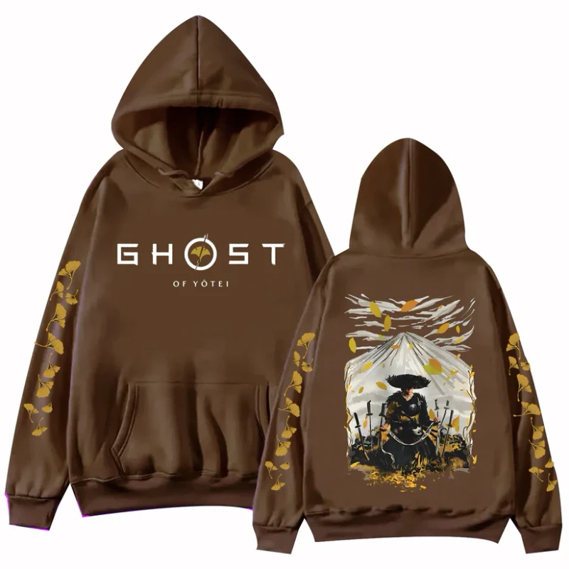
Belle Epoque Paris and Mount Fuji don't share a timeline, but both look good on a hoodie. The Brown edition pairs Atsu & Mount Fuji artwork with a chestnut fleece-lined blend that suits autumn the way gas-lit boulevards suit dusk. $44 USD, flat $10 shipping to 100+ countries -- and, to be fully honest, it's a different game than the one this article is about. That's the deal at Huzi Style: Ghost of Yotei only, made for people who read art-direction breakdowns for fun.