When the first trailer for Clair Obscur: Expedition 33 dropped, the most common reaction in art circles was not about the gameplay or the story. It was about how the game looked. Sandfall Interactive, a studio of roughly 30 people, had produced visuals that rival the output of studios ten times their size, and they had done it with a distinctive painterly aesthetic that does not look like anything else on the market. Achieving that look in Unreal Engine 5 required a combination of custom shaders, post-processing pipelines, texture work, and color science that goes far beyond dropping UE5's default settings and calling it a day. The result is a game that genuinely looks like an oil painting come to life, with visible brushstrokes, layered color washes, and a warmth that distinguishes it from the cold photorealism that dominates most AAA releases.
The Core Problem: Making UE5 Look Like a Painting
Unreal Engine 5 is built for photorealism. Nanite and Lumen, its flagship rendering technologies, are designed to simulate physical light behavior and render geometric detail at levels that approach photographic quality. The entire engine architecture pushes toward visual fidelity that is measured by how closely it resembles reality. Sandfall's art team needed to go in the opposite direction, using these hyper-realistic tools to create something that looks deliberately hand-painted. This is not as simple as applying a post-processing filter over a realistic scene. Any artist who has tried to make a photograph look like a painting can tell you that slapping a Photoshop watercolor filter on a photo produces an unconvincing mess. The same principle applies to real-time rendering. If you start with realistic geometry and lighting and then try to paint over it, the result looks like a realistic game with an art filter, not a game that was designed to look painterly from the ground up. Sandfall's approach was to build the painterly quality into every layer of the rendering pipeline, from the geometry and textures up through the lighting and post-processing, so that the final result feels cohesive and intentional.
Brush-Stroke Textures and Surface Treatment
The most immediately visible element of Expedition 33's painterly style is the brush-stroke texture work applied to virtually every surface in the game. Sandfall developed a custom texture pipeline that generates directional brush-stroke patterns at multiple scales, from large, visible strokes on walls and ground surfaces to finer, subtler strokes on clothing and character details. These are not simple tiling normal maps applied as an afterthought. Each surface type has its own brush-stroke characteristics that reflect the kind of paint application that would be used to render that material in a real painting. Stone walls show thick, impasto-style strokes with visible ridge highlights. Wooden surfaces display finer, grain-following strokes. Metallic objects have smooth, blended applications with sharper detail edges, mimicking how a painter would handle reflective surfaces. The texture team created custom Substance Designer graphs specifically for generating these patterns, and the result is a library of surface materials that feel stylistically unified while still reading clearly as distinct materials in gameplay. You never mistake a stone wall for a wooden door, even though both are rendered in the same painterly style.
Post-Processing: The Painting Filter That Is Not a Filter
The post-processing stack in Expedition 33 is where the painterly illusion is most fully realized, and it represents some of the most sophisticated shader work in any UE5 game. The key insight that Sandfall's technical art team arrived at early in development was that a painting does not look like a photograph because of how a painter handles edges. In a photograph, edges are defined by focus and contrast. In a painting, edges are defined by the artist's deliberate choices about where one color ends and another begins. Some edges are sharp, some are soft, some are lost entirely, and these variations create the sense of human intentionality that distinguishes a painting from a photograph. Sandfall implemented a custom edge-processing shader that analyzes the scene in real time and applies different edge treatments based on depth, surface angle, material type, and lighting conditions. Flat surfaces facing the camera receive softer, more blended edges that mimic the way paint spreads on canvas. Silhouettes and high-contrast boundaries receive sharper edges that read clearly in gameplay. The system dynamically adjusts its behavior based on the camera distance and angle, so close-ups show more visible brushstroke detail while distant shots simplify into broader washes of color, exactly as a real painting would resolve at different viewing distances.
Color Palette Design: Belle Epoque Meets Surrealism
The color palette of Expedition 33 draws from two primary art-historical sources: the warm, golden tones of Belle Epoque painting and the unsettling, saturated hues of early 20th-century Surrealism. Lumiere and the game's safer regions use a palette dominated by amber, ochre, deep burgundy, and warm cream, colors that evoke gas-lit Parisian streets and the interiors of turn-of-the-century cafes. As the player ventures deeper into the painted world, the palette shifts toward cooler blues, acidic greens, and stark contrasts that create an atmosphere of increasing unease. This color transition is not random. Sandfall's art director developed a color script for the entire game, similar to what animation studios use for feature films, mapping specific color ranges to specific story beats and emotional targets. The Lumen global illumination system in UE5 normally produces physically accurate color behavior, which would work against the painterly palette. Sandfall modified Lumen's color response curves to favor the palette's target tones, so that even dynamically calculated light bounces contribute to the intended color mood rather than introducing unwanted hues. This modification required substantial custom work within UE5's rendering pipeline, but the result is a game where the lighting always feels cohesive with the art direction regardless of what the player does or where they go.
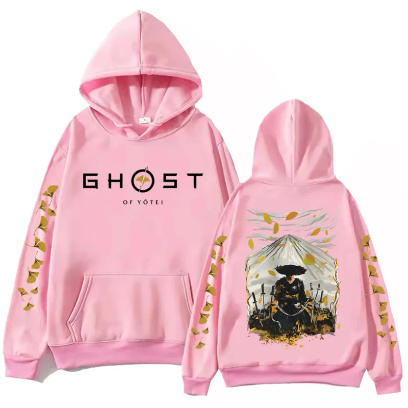
Sandfall's color script moves from warm ambers to uneasy blues as the story darkens, a smarter approach to color than most wardrobes ever manage. The Ghost of Yotei Kawaii Pink Hoodie is our take on a statement hue done properly, $44 and printed with eco ink. A little saturation is good for the soul.
Nanite and Lumen: Modified for Style
Nanite, UE5's virtualized geometry system, presents a specific challenge for stylized rendering because its primary advantage is rendering extreme geometric detail. When your goal is painterly simplicity, extreme detail can work against you by making surfaces look too real and too crisp. Sandfall's solution was to use Nanite not for maximum detail but for consistent detail at an artistic level. The team created geometry that includes deliberate imperfections at the Nanite level: slightly uneven surfaces, wobbly edges on architectural elements, and organic irregularities that prevent the geometry from reading as too clean or too precise. These imperfections are baked into the Nanite meshes at the highest level of detail and are visible at all distances because Nanite does not use traditional LOD (level of detail) streaming that would smooth them out at range. Lumen was similarly modified to support the painterly look. The default Lumen configuration produces realistic shadow edges and light falloff that are too photographically accurate for the art style. Sandfall adjusted Lumen's shadow softness parameters, ambient occlusion behavior, and bounce light intensity to produce lighting that reads as painted rather than photographed. Shadows in Expedition 33 have slightly softer, more diffused edges than they would in a standard UE5 scene, and light bounces are tuned to fill shadows with warmer, more saturated tones than physically accurate calculation would produce.
How a Small Team Achieved Big Visual Results
The most impressive aspect of Expedition 33's visual achievement is the team size. Sandfall Interactive had approximately 30 core developers working on the game, and the environment art team was a fraction of that number. Producing the volume of handcrafted environments that Expedition 33 contains with such a small team required careful workflow optimization and a willingness to invest in tools that multiplied the team's productivity. The custom Substance Designer graphs for brush-stroke textures, the modular environment kits that allow a handful of assets to generate enormous variety through recombination, and the post-processing pipeline that applies painterly treatment universally without per-scene manual tuning, all of these tools represent upfront investment that paid dividends across the entire production. ArtStation featured the Sandfall team's work in a detailed breakdown that generated enormous attention from the technical art community, and the consistent question in the comments was how such a small team achieved results that rival the output of studios with ten times the headcount. The answer, based on the team's public talks and interviews, is a combination of strong art direction that provided clear targets for everyone to aim at, technical infrastructure that automated the aspects of the painterly look that did not require manual intervention, and a studio culture that prioritized visual quality over feature quantity.
From the Huzi Style Collection
Every visual choice in this game was deliberate, and we try to run Huzi Style the same way, one product at a time instead of a wall of forgettable merch. The Ghost of Yotei Kawaii White Hoodie is $44, minimal where it counts and detailed where it matters. If you love games as art, this collection was made with you in mind.